Everything Turquoise, Interior Home, Design, Architecture

Monday, September 9, 2013

Guest Blogger: Lesli from My Old Country House

Hi there! This is Lesli DeVito from My Old Country House Blog...I am pleased as punch to be a Guest Blogger during Erin's little maternity blogging break...By the way, THANK YOU to those of you who gave of your HEARTS to Erins VIRTUAL BABY SHOWER...and if missed out, you can still stop by and leave Erin and Chris your "GIFTS"

ERIN AND I....LIKE MANY OF YOU...BONDED OVER A COLOR. AQUA. I love COLOR. I LOVE AQUA. I Love it in my Paintings... I love it in my home. AQUA. There is something very comfortable about those BEACHY colors...faded from love...the cast offs that often furnish beach homes, used and faded pieces that have already established themselves...classics...inherently soothing.
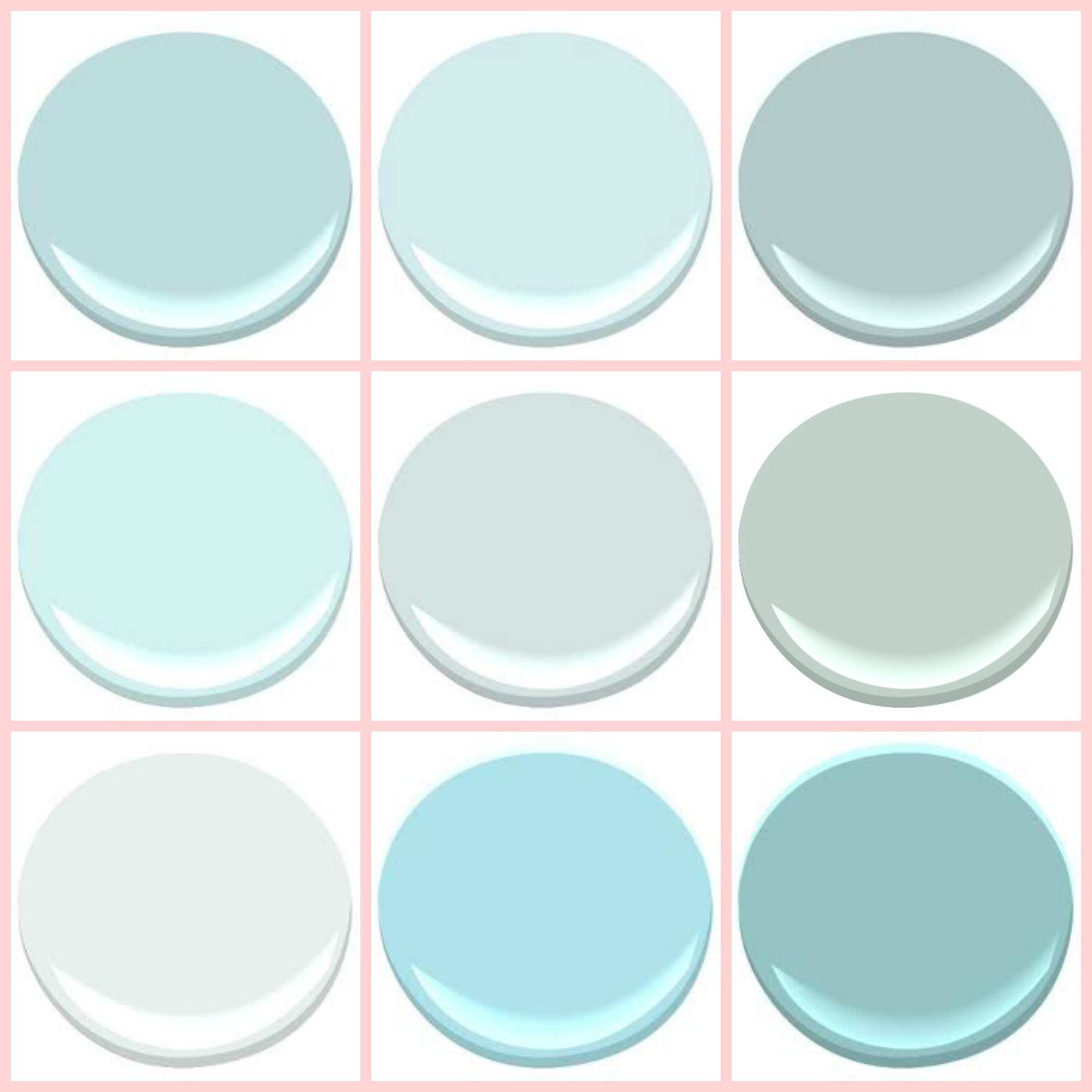
BENJAMIN MOORE: BIRDS EGG, CLEAR SKIES, GOSSAMER BLUE, ICEY MOON DROPS, OCEAN AIR, PALLADIAN BLUE, SEAFOAM, SERENITY, TRANQUIL BLUE

BENJAMIN MOORE - "THE BEACH BLUES ": BIRDS EGG, CLEAR SKIES, GOSSAMER BLUE, ICEY MOON DROPS, OCEAN AIR, PALLADIAN BLUE, SEAFOAM, SERENITY, TRANQUIL BLUE.

When I was contemplating what color to paint our newly renovated master bathroom this past Spring...I hoped that one of these colors would work with our Grey Master Bedroom. One of the colors in particular, "PALLADIAN BLUE", has been on my radar for a while...and then, when I was in Los Angeles this SPRING, I fell in love with the wall color of A store called...
"HOLLYWOOD AT HOME" and guess what.....
It was painted "PALLADIAN BLUE"!!!
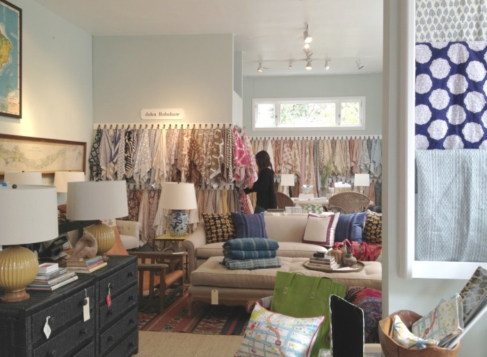
HOLLYWOOD AT HOME,  LOS ANGELES CA  
HOLLYWOOD AT HOME, LOS ANGELES CA

I COULD NOT WAIT TO GET HOME AND START PAINTING!!!

I THINK YOU WILL AGREE, THE COLOR WORKS!
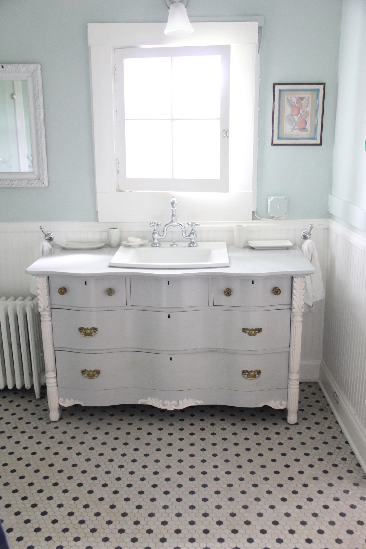
mbath6
New Bathroom..including new ceilings!
mbath4

When doing any type of Renovation, especially in KITCHENS AND BATHROOMS.... a SURE FIRE way to save BIG BUCKS is to utilize the existing footprint. ...moving plumbing is WHEN THE DOLLARS CAN START OT ADD UP! So, In this case, I looked EVERYWHERE to find a High Quality, Good-Looking Corner Shower unit which would line up with our existing shower drain. AND I DID IT!!!! I DID A "HAPPY DANCE" when the drains matched PERFECTLY!!!

I ABSOLUTELY, POSITIVELY AM IN LOVE WITH OUR SHOWER!!!

Shower- VIGO 47" X 47" NEO ANGLE SHOWER from BELLACOR. This is an item worth price shopping for. VIGO makes great products . This "KIT" came complete with everything except the faucets and shower head, and it was a fraction of the cost of buying the base and having glass cut.

shower

SHOWER FAUCET- Listen up. ALL NEWLY INSTALLED showers must be PRESSURE BALANCE ones. But, the pressure balance showers do not work well in Big old Country Houses. In addition, the part that goes inside the wall was fine and did not need to be replaced. What I found out the hard way was that the external hardware for the NEW showers, often does not fit the OLD internal hardware. BUT, I after buying and trying and returning about 5 trim kits, I finally found one!! The MARIELLE BY PFISTER...IT fitS my American Standard internal unit...and I actually did another little happy jig the day I found it!!!!

The SUBWAY tile - from LOWES. gives the shower a Custom appearance and elevates the look.The tile comes in boxes of 100 tiles for around $21 by the individual tile for .22 cents each. AND You can return any tiles you do not use.Even if you just have 5 left! The decorative tiles around the center were a last-minute addition, I ran to Lowes to get some more caulk and these decorative tiles were on sale for 75 cents a piece vs the original $2.75. I thought they would make a nice addition and dress the shower up a bit. I LOVE them.

IMG_9836

COLOR PALETTE...
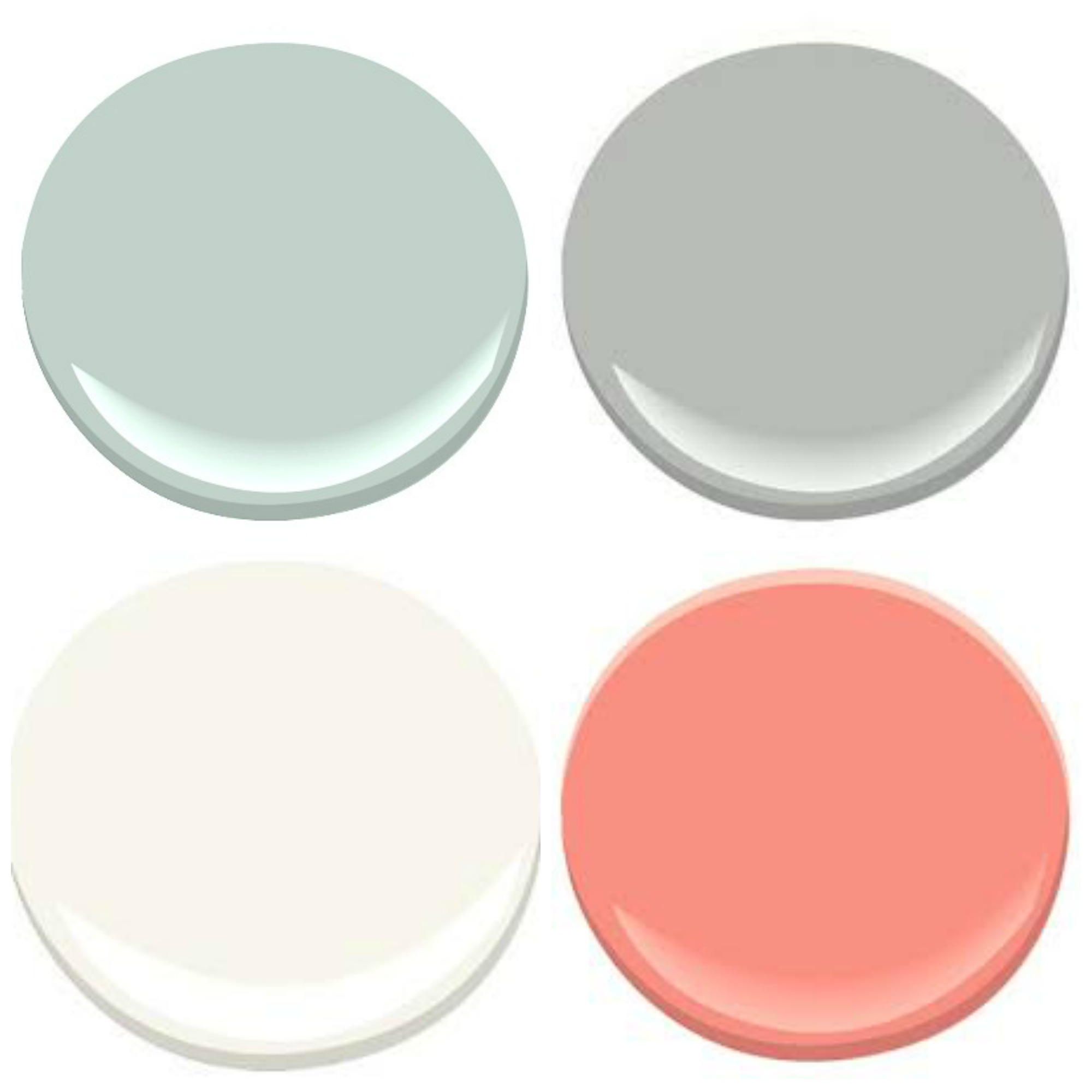
MASTER BATHROOM- PALLADIAN BLUE, COVENTRY GRAY, CORAL GABLES, MOUNTAIN PEAK WHITE 
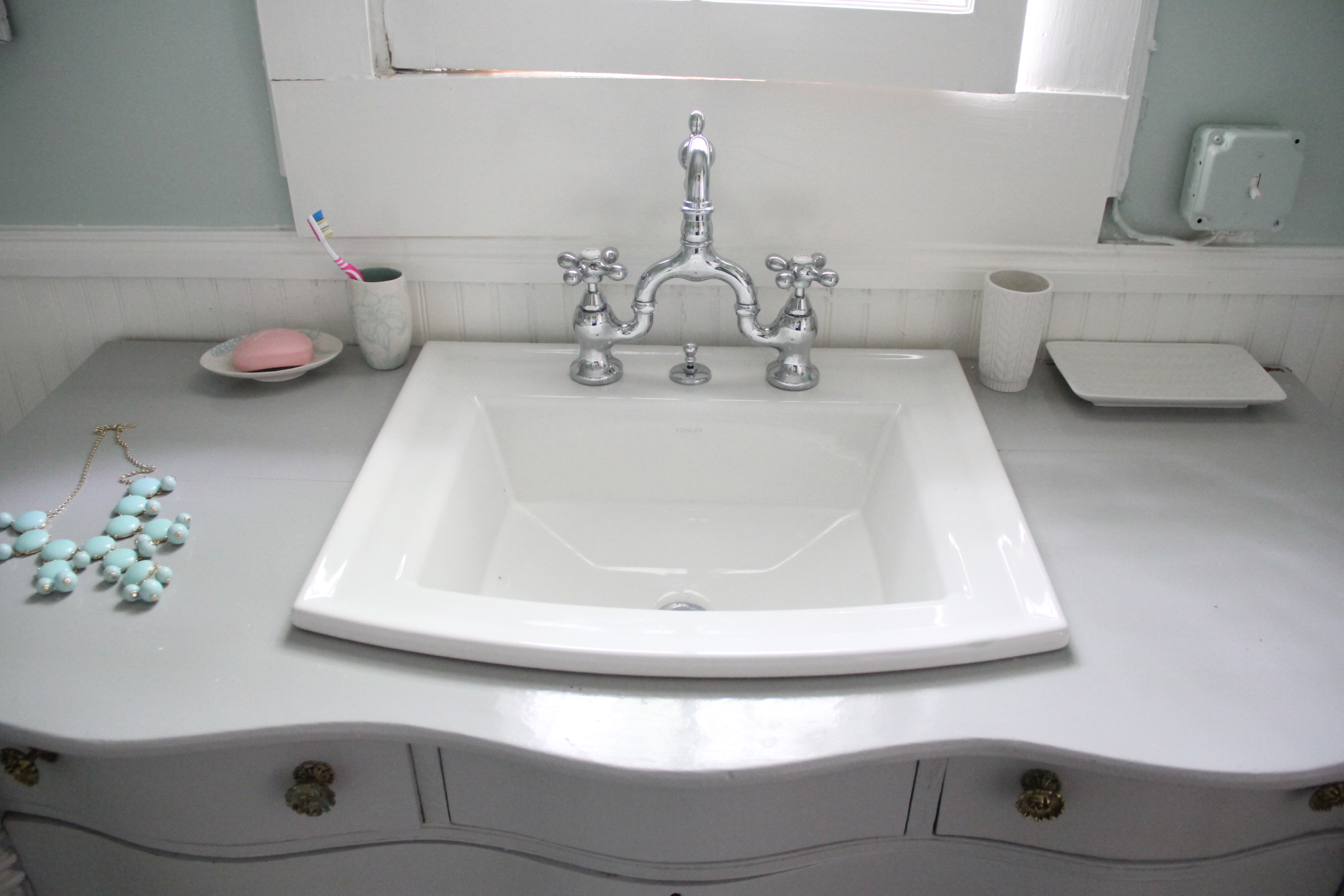
MASTER BATHROOM-
PALLADIAN BLUE, COVENTRY GRAY, CORAL GABLES, MOUNTAIN PEAK WHITE

mbath6 
VANITY - Imagine the happy JIG I did, when I went SHOPPING at my favorite used furniture store CIRCA fIN CHARLOTTESVILLE, VA F or a dresser to have made INTO a Bathroom Vanity and INSTEAD found A DRESSER ALREADY MADE INTO A VANITY!!! All I had to do was paint it, inside...'BENJAMIN MOORE "CORAL GABLES" AND THE EXTERIOR "COVENTRY GRAY".

IMG_1181
KOHLER ARCHER SINK - This sink by Kohler is the largest drop in sink when it comes to coverage of your vanity top. I knew the top would be just the varnished top of the dresser so wanted as much overlap as possible. LOVE THIS SINK! Under $200 at Lowes.
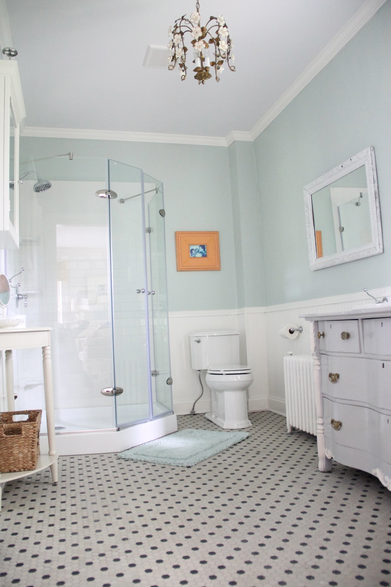
mbath3 
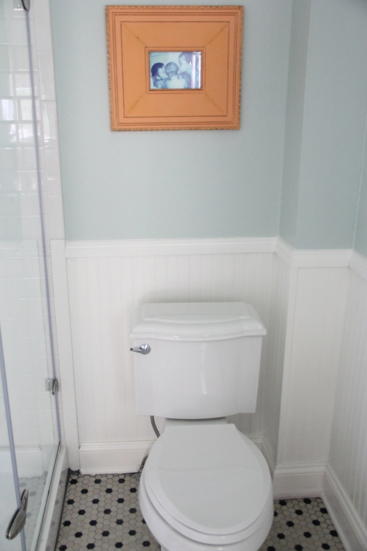
KOHLER DEVONSHIRE TOILET- I have said it before and I will say it again, I think it is worth the few extra pennies to buy a snazzier looking toilet. Come on, it is the "Anchor" of the room...and this new Devonshire uses less water, less space and looks pretty to boot! Price shop - we got this one at Lowes for under $300

pretty potty 
POP OF COLOR: Many people do not realize that you can do a POP of color...ON another color...you just need to be subtle and LESS IS MORE. I found this frame painted this awesome kind of tangerine-peach color...works perfectly with the Palladian blue.

The floor is Hexagon Tile from Home depot...Post here.
IMG_1199

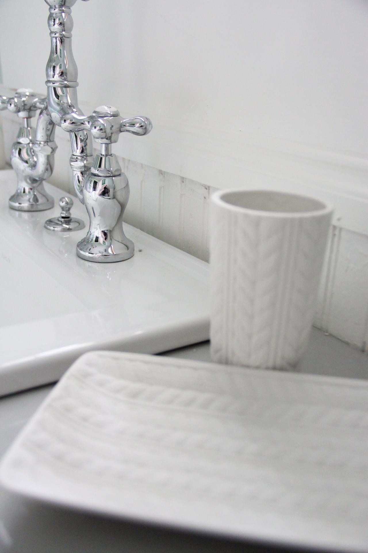
I agonized, (sorta sounds stupid now) but I spent hours trying to decide whether to go with Brass or Polished Chrome in the master Bathroom. I finally chose the Chrome. Both are timeless, and both would look great but I just did not think that over time the Brass would keep me as happy as the Chrome does. again...so silly. But it mattered at the time.

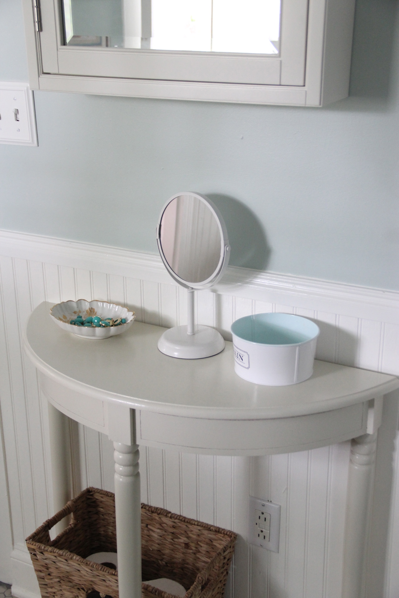
MEDICINE CHEST AND TABLE- The medicine chest is from Pottery Barn and the little Demi Table is from our new Homegoods! It was $59 and while I intended to paint it, it looks so nice with the cabinet I am leaving it alone.

MBATH1

mbath9
sconeshl1 
PRINCETON SOPHOMORE SCONCE FROM SCHOOLHOUSE ELECTRIC
newsconce

mbath7
I love standing at my new sink and looking out across the back yard...I can see the Cows next door and the kids and pets running around...It is so peaceful...
IMG_9876

The Green Scalloped Mirror (pop of color #2, was a $15 Thrift store find that I spray painted Kelly Green. I LOVE this mirror!!!

IN CLOSING...You may or may not have notices that the Bathroom does not have a door....not usually the way things roll in a Bathroom. Did you know Doors use up 7 square feet of room space? It had always bothered me that our bathroom door had to be closed in order to stand at the sink and so WE decided to go with a barn door, which will slide across the wall next to the sink...we just have to hang that durn door and we are done!!!

Thank you for letting me share my THE MASTER BATHROOM!!!

I INVITE YOU VISIT MY OLD COUNTRY HOUSE...!  I WOULD LOVE TO SEE YOU THERE!!
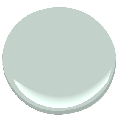
PALLADIAN BLUE
PALLADIAN BLUE


...If you love color as much as I do...you will LOVE the "ROOM FOR COLOR 2013" contest currently on Apartment Therapy...and guess what...My room was selected! The number of "favorites" you get determines if you go to the finals..

http://www.apartmenttherapy.com/leslis-phoebe-holiday-room-194123

If you have a moment "FAVORITE" MY ROOM!!! and Thank you so much!!!
You have read this article Bathroom / Great Paint Colors / Guest Blogger / Palladian Blue with the title . You can bookmark this page URL https://kmn-radio.blogspot.com/2013/09/guest-blogger-lesli-from-my-old-country.html. Thanks!
Friday, September 6, 2013

Guest Blogger: Kristie from The Decorologist

Hey guys!  I'm Kristie Barnett of The Decorologist.  Today I'm sharing a project that required a major color makeover.  When my client bought this home last year, it was too dark for her sunny personality. There's nothing like a whole lot of white to give a dated home an instant facelift.  With a backdrop of white, even hints of color pop - like the turquoise and pink you will see throughout this space.

white slipcovers
There's absolutely nothing like a good before-and-after, especially when I get to take part in the magic! So let's start with the "before" of the front room of the house:

DSC_7944
before 

My client, Christiana, wanted a breezy space with only a whisper of color on the walls.  I brought out lots of colors to show her, and she kept saying, "that's too much color!"  We finally chose Benjamin Moore's Gray Owl for the walls and Chantilly Lace trim.  Gray Owl, a light gray with the slightest blue undertone possible, is the perfect backdrop for all her white fabric and painted furniture.
benjamin moore gray owl
At my suggestion, she actually painted the 1980's glossy wood grandfather clock white.  The piano you see is next on the list for a paint makeover!  I have another client who no longer needed it, so I hooked them up and Christiana got to take this baby home for FREE.

white dining room

Maybe I can convince her to paint it turquoise!
white plates on wall

Again, the previous color palette was warm and fairly dark.  It's difficult to imagine all the white furnishings in a space like this, isn't it?

DSC_7943
before 

This inexpensive IKEA light fixture makes a formal entry a bit more playful.

white walls

The dining room serves double-duty as a homework and craft space for her children.  The lack of overhead lighting makes an opportunity for creativity - my client hung an old ladder from the ceiling and uses it to hang paper garlands, pom-poms, and other crafted lovelies.
 
gray owl living room

This is a "before" shot from the opposite side of the room.  The oak trim dictated warmer colors, not the cooler palette my client was hoping for.

DSC_7953
before

The bright, white trim makes a huge difference in the space.  The oak trim pulled your eye and chopped up the room.  With white trim and light gray walls, the entire room looks larger, more open, and quite heavenly! Christiana made all of the beautiful slipcovers in this house.  Her specialty is ruffled tablecloths, which you can find in her Etsy Shop, Ruffled Linens.

shabby chic dining rooms
As we move into the family room, you can see how dark this space was previously.  Although the paneling had already been painted, the brick wall dominates the space and the oak beams look dated.

red brick wall
before

To give my client a clean, fresh look in this living room, I chose Benjamin Moore's Classic Gray for the walls, Chantilly Lace for the trim, Kendall Charcoal for the beams, and Gray Owl for the ceiling.  Of course she wanted a lighter, brighter room, but Christiana had no idea how much LARGER her room would appear with the new paint color scheme.
shabby chic living room
after 

Christiana ordered a large jute rug from Pottery Barn, and then we layered it with a smaller, graphic blue-and-white flat weave rug  I found on RugsUSA.

turquoise white living room
We found the vintage turquoise lamps at a barn sale outside of Nashville.  

turquoise lamp
I found this crafted paper wreath at a local antique mall.  That picture in the middle is of Napoleon!

white mantel
turquoise tray
white fireplace
white bookshelves
white kitchen
No major money was sunk into the breakfast room - a kitchen doesn't need to be fancy to be beautiful. Ikea lighting, white plates, and a white ruffled tablecloth that my client makes for her Ruffled Linens Etsy shop are all that's needed to put the focus on the outdoors beyond and the blue hydrangeas from her garden.


white kitchen
hydrangeas
I hope you enjoyed the befores-and-afters of this Nashville home!  Thank you to Erin for letting me share here again on her beautiful blog.  If you want to learn more about transforming your home by choosing beautiful paint colors, mixing high and low decor, and arranging furniture and accessories, please come visit me at The Decorologist! 
You have read this article Dining Room / Guest Blogger / Living Room / Turquoise and Gray / Turquoise and Pink with the title . You can bookmark this page URL https://kmn-radio.blogspot.com/2013/09/guest-blogger-kristie-from-decorologist.html. Thanks!
Thursday, September 5, 2013

Guest Blogger: Jennifer of JWS Interiors/Affordable Luxury

Hi Everyone,

I'm Jennifer of the blog JWS Interiors/Affordable Luxury and am thrilled to be guest posting for Erin today. Thanks so much Erin for the opportunity to blog for HOT readers! So thrilled for you and your family with your new baby!

I wanted to share with you today photos of my family room which I recently completely.  As an interior decorator and mother of two daughters under the age of 7, I am constantly looking for ways to beautify and simplify our home without breaking the bank. Messy hands can do a number on upholstery, so when it was time to re-do our family room to allow for more seating, I had to stay on budget, yet still wanted the end-result to look and feel luxurious while maintaining family-friendly pieces. (Interested in where some of the items were purchased? Sources are listed after the last photo)

For more daily design inspiration or if you are interested in an E-DECOR service, I invite you to check out my blog!

XOXO
Jennifer


Quick background on this project: 
The fun white chandelier from West Elm (discontinued) emphasizes the custom ceiling; I used two identical sofas (from World Market!)  to keep the space serene and then added the pretty linen pillows from HomeGoods to add some additional color and pattern.  The white flokati rug was a find on Amazon and "broke up" the neutral tan carpet and provided the perfect backdrop for the Oly Studio look-alike coffee table from HomeGoods.  To add additional character, I found the iron finials on the fireplace at an antiques market and then added the vases for photo purposes to bring out the colors in the art. Black and white frames are from Target.

I did all of this without spending a ton of money, my kids can plop down on the sofa and I don't get worried about whether it will stain!
You have read this article Guest Blogger / Living Room / Turquoise and Gray with the title . You can bookmark this page URL https://kmn-radio.blogspot.com/2013/09/guest-blogger-jennifer-of-jws.html. Thanks!
Wednesday, September 4, 2013

Guest Blogger: Kathryn from Kathryn J. LeMaster Art & Design

Well hello there! Kathryn here, from Kathryn J. LeMaster Art & Design. I am just tickled to be here today filling in so our favorite HOT mama and her new little one can spend more time together and hopefully catch up on some well deserved R&R!

Like Erin and most of you, I can't get enough of the color turquoise and all of its beautiful variations. Though I've always been drawn to this happy hue, it seems to have snuck up on me in recent years, climbing the charts and becoming my number one favorite color.

If memory serves me correctly, I believe it was all a head-first-downward-turquoise spiral after the garden stools. Ah, yes. The eye-catching, room-popping turquoise garden stools. A perfect pair.
Once upon a time I stumbled across them on One King's Lane. They called my name and it was love at first sight. They now live happily-ever-after in my entry way (above). Each time I walk through the room they greet me with a cheery smile that brightens my day the way only turquoise can. 

Today I want to pass along to you the day-brightening smile that is everything turquoise. It is my honor to share with you a few of my favorite pics of this winning color in action!
Lisa McDennon
Peppermint Bliss
BHG
A Beautiful Mess

Hannah Berman via Design Sponge

Breathe Happiness

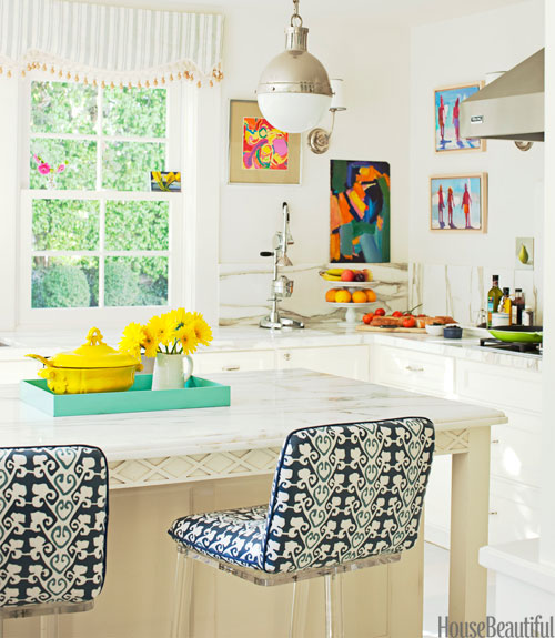
Ruth Sommers via House Beautiful
I hope this little picture parade brought you a smile! To see more of my favorite turquoise inspiration, check out my previous blog post on turquoise, here.

I've had a blast sharing with you today, so thanks for being here! Please feel free to come on by and visit me anytime at kathrynjlemaster.com. I'd love to see you there!

Until next time...

Ciao! ;)

-Kathryn
You have read this article Bedroom / Foyer / Guest Blogger / Kitchen / Painted Door with the title . You can bookmark this page URL https://kmn-radio.blogspot.com/2013/09/guest-blogger-kathryn-from-kathryn-j.html. Thanks!